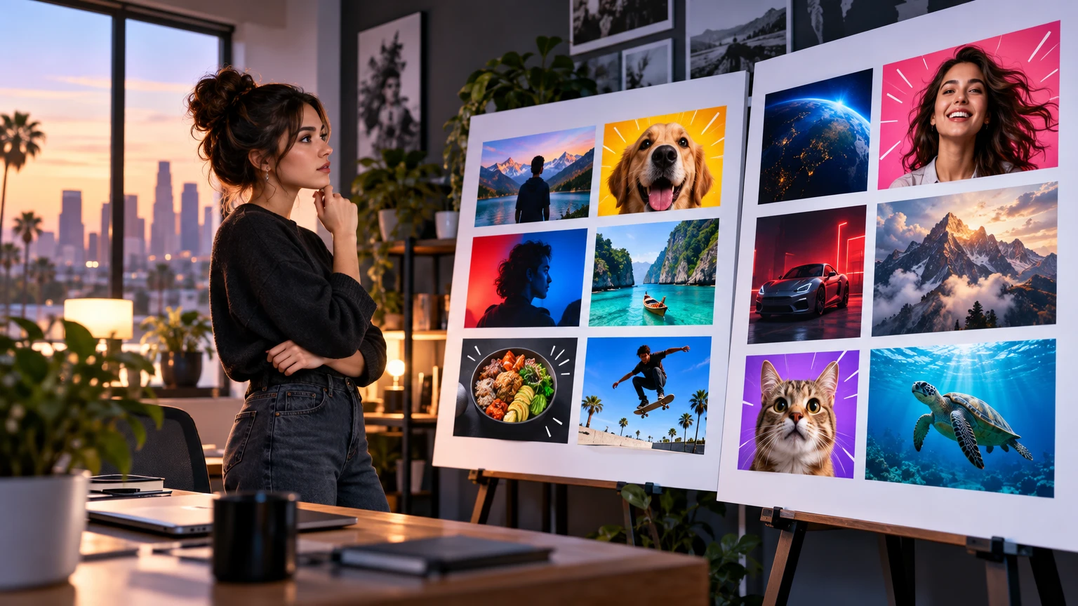

Check the promise first
A thumbnail analyzer should start with the question a viewer can answer in one second: what is this video promising me? The promise can be a result, a comparison, a risk, a discovery, or a transformation. If the image only shows a topic, the viewer has less reason to stop.
Write the promise in one sentence and compare it with the image. If the promise depends on the video title to make sense, strengthen the visual evidence or simplify the headline.
- Name the main outcome or tension.
- Show one visual clue that proves the promise.
- Remove decorative elements that do not support the idea.
Review hierarchy and contrast
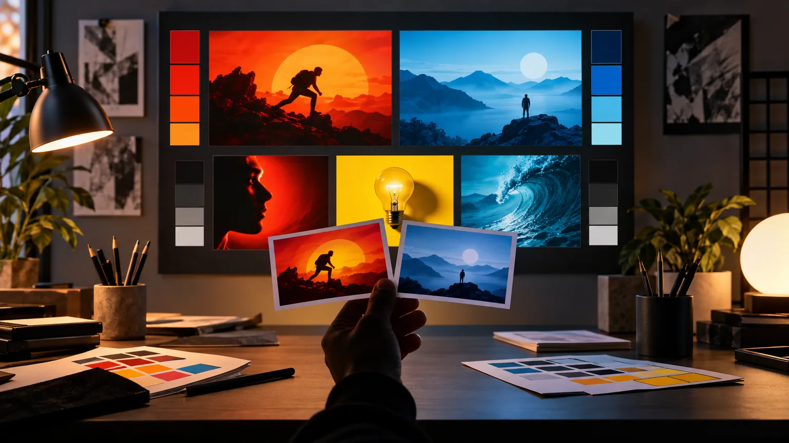
The eye should find the primary subject immediately, then the object or visual conflict, then the short text. Equal-size subjects and low-contrast backgrounds make the thumbnail feel busy even when the canvas contains only a few elements.
Check the image in grayscale or with the saturation reduced. If the subject disappears into the background, increase separation through scale, lighting, outline, or placement instead of adding more effects.
Run the small-card test
A thumbnail may look excellent at full size and fail in the home feed. Reduce it until it resembles a small recommendation card. At that size, the face, object, and headline should still be identifiable without zooming.
Review the design on a phone and in both light and dark surroundings. The goal is not to make every detail visible; it is to preserve the one idea that earns the click.
- Keep the focal subject large enough to recognize.
- Use short text with strong letter-to-background contrast.
- Keep important faces, objects, and words away from the edges.
Make one change at a time
When a thumbnail underperforms, change one signal at a time. Start with clarity, then hierarchy, then contrast, and finally style details. Changing everything at once makes it difficult to learn what improved the design.
Save the versions that pass the checklist so your next upload begins with a tested visual system rather than a blank canvas.