
Make the result obvious
Click-through rate improves when the right viewer understands the value of the video quickly. Make the result visible through a before-and-after, a clear object, a strong reaction, or a measurable contrast. The image should give context without requiring a paragraph of explanation.
A strong thumbnail does not reveal every detail. It gives the viewer enough evidence to understand the category and enough open space to wonder what happened.
Use curiosity that the video can satisfy
Curiosity works best when it is specific. A hidden result, unusual object, visible risk, or surprising comparison can create a question that the video answers. Generic shock faces and vague red arrows usually create noise instead of a useful reason to watch.
Before publishing, ask whether the first minute of the video delivers on the expectation created by the thumbnail. Honest curiosity protects viewer trust and helps the channel build returning audiences.
- Show a real tension or unanswered question.
- Avoid visual claims the video cannot support.
- Keep the title and thumbnail complementary rather than repetitive.
Design for the recommendation feed
A thumbnail competes with many other images, so separation matters. Use a dominant subject, a distinct background value, and a limited accent color. Test the design at small size before polishing details that will disappear in the feed.
Two or three meaningful elements often create more clarity than a collage of every topic covered in the video.
Test a focused variable
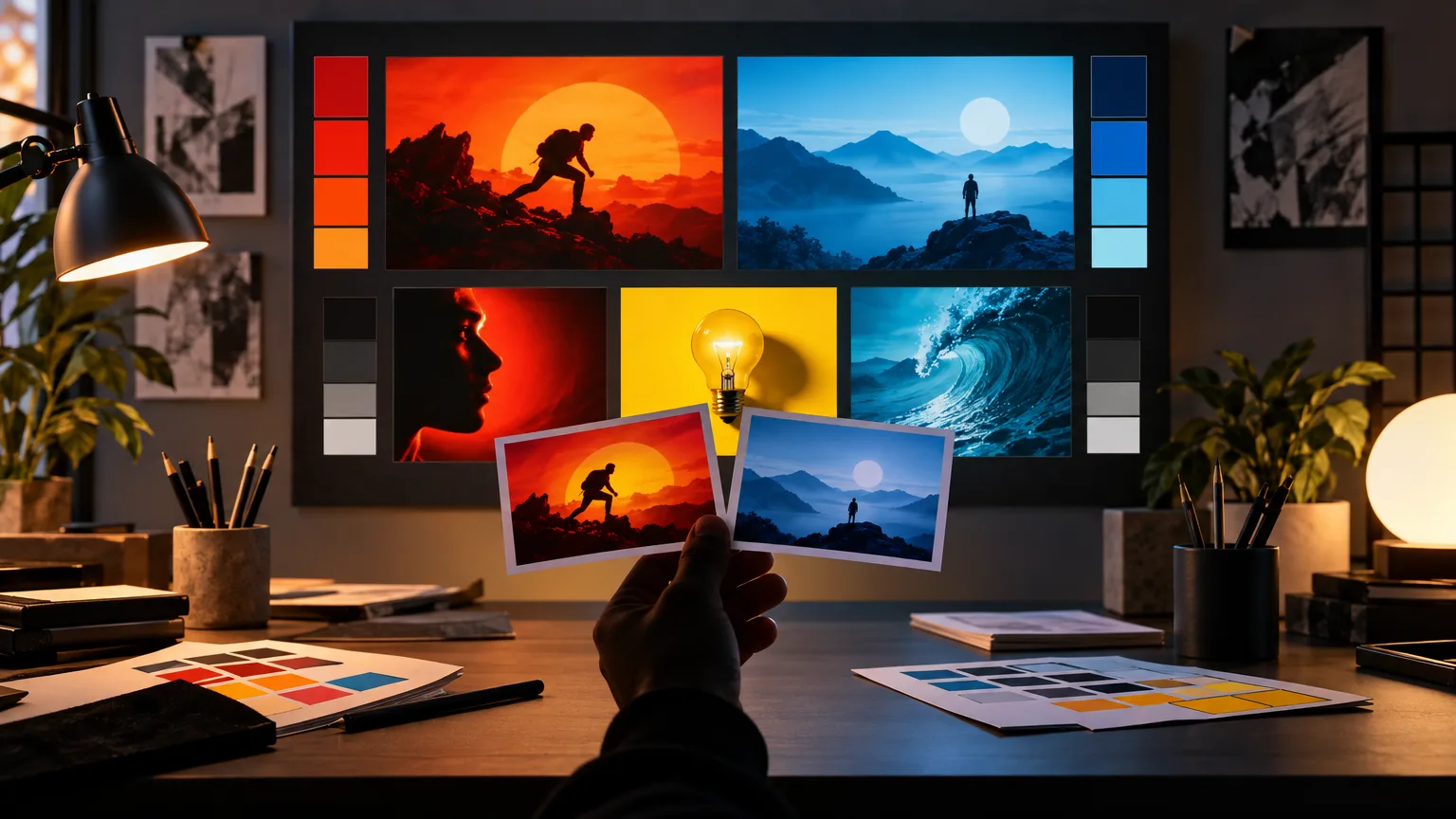
When you compare thumbnail options, change the variable that matches the problem. Test a different focal subject when the idea is unclear, a different promise when the value is weak, or a different contrast treatment when the design disappears on mobile.
Keep notes about the audience, topic, and result. Over time, the channel will develop a repeatable understanding of which visual promises earn qualified clicks.