Match the idea to the channel promise
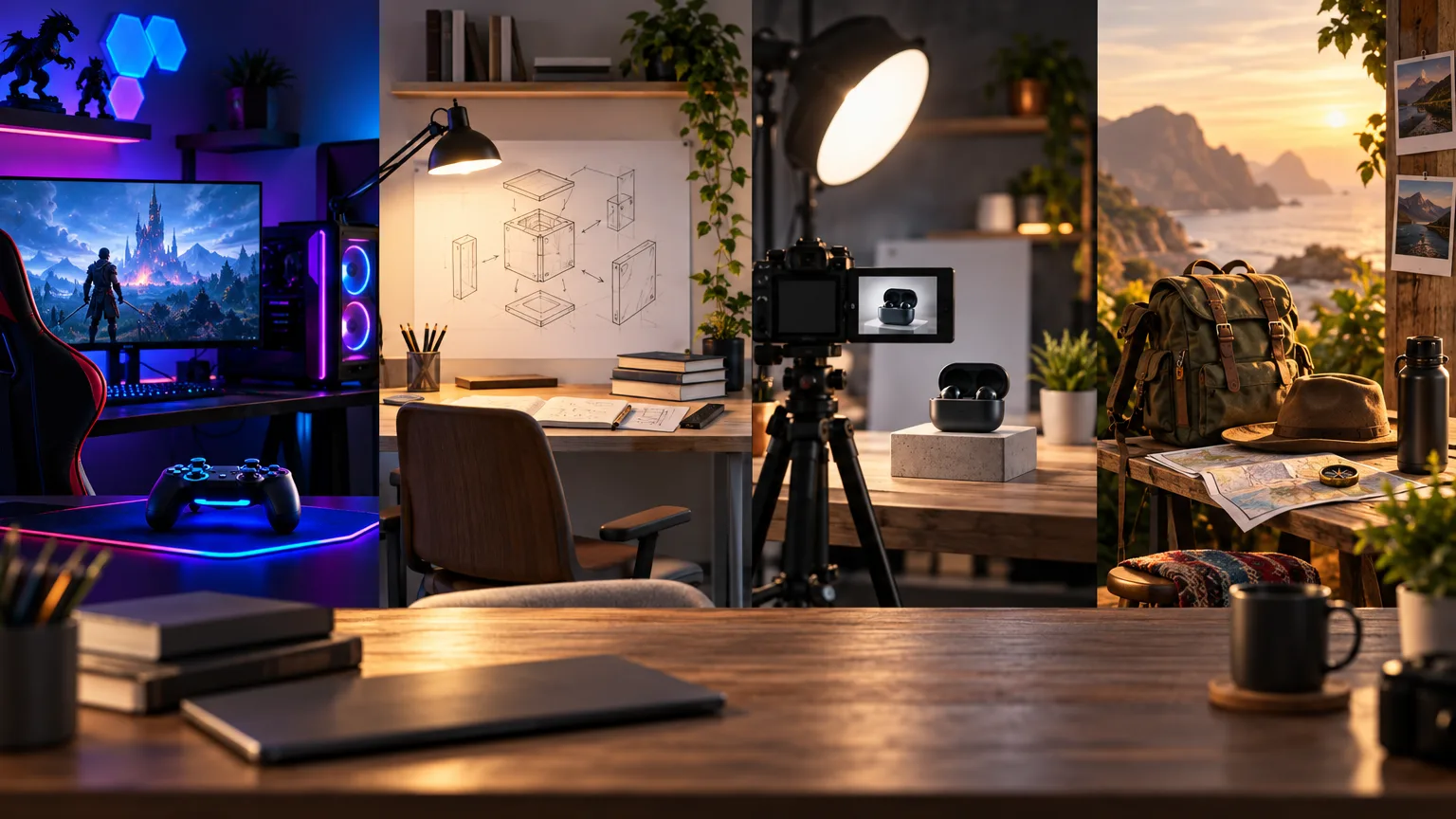
A thumbnail idea works when it makes the channel’s kind of value visible. Gaming viewers may want to see the danger, opponent, or impossible moment. Tutorial viewers need a result they can imagine achieving. Review viewers look for the product, decision, or surprising tradeoff. Vlog viewers often respond to a place, personal moment, or unusual situation.
These are starting points, not formulas. Use the specific story of the upload to choose one focal subject and one visible change. A channel type gives you a useful vocabulary; the video gives you the reason for the click.
- Name the audience’s expected payoff before choosing the image.
- Show the moment, object, or result that makes this upload different.
- Let the title add context instead of filling the thumbnail with explanation.
Gaming: show the decision or danger
Gaming thumbnails are strongest when the viewer can sense a specific decision, threat, or payoff. Feature one original game-world character, boss, item, map problem, or player reaction rather than a screenshot packed with tiny interface details. Scale the important object until it survives a small feed preview.
For a challenge, show the rule being tested. For a discovery, show the unusual item or location. For a competitive match, create a clear face-off or consequence. Neon lighting can add energy, but it should separate the focal subject rather than flatten every part of the frame into the same glow.
Tutorials: make the result recognizable
Tutorial viewers want to know what they will be able to do after watching. Make the result visible through a before-and-after, a finished object, a highlighted step, or a presenter beside the thing being explained. A clean visual proof usually does more work than a headline that says “how to” again.
Keep the background organized and leave a calm area for a short lesson cue if you need one. A hand, tool, screen, or finished result can provide action without showing every step. The thumbnail should promise understanding or progress, not reproduce the entire lesson plan.
- Show the finished outcome or the problem being solved.
- Use one instructional object as the visual anchor.
- Choose a background that makes the process feel approachable.
Reviews: frame the decision
A review thumbnail should help a viewer understand the decision they are considering. Feature the product large enough to recognize, then add one visual cue for the tradeoff: a cracked screen, a dramatic size comparison, a premium material, or a clear before-and-after. Avoid filling the frame with every accessory or specification.
Use the expression and pose of a fictional reviewer as support, not as the entire story. The product, result, or question should remain clear when the face is reduced. Honest tension such as “worth the upgrade?” is more useful than a claim the review cannot support.
Vlogs: choose the moment, not the itinerary
A vlog can cover an entire day, but a thumbnail usually needs one moment. Show the unusual place, difficult choice, unexpected encounter, or personal consequence that gives the trip its shape. A wide scene can work when it creates scale; a close-up can work when the emotion or object is the reason to watch.
Keep travel context visible without turning the frame into a postcard. A backpack at a strange doorway, a person facing a huge landscape, or one local object in a real setting can create a stronger open loop than a collage of destinations. Let the title explain the route while the thumbnail shows the moment.
Turn the idea into a reusable system
Save the patterns that fit your channel: the scale of the subject, the amount of context, the kind of reaction, and the accent color that helps returning viewers recognize your uploads. A repeatable system makes ideation faster without making every thumbnail identical.
Before publishing, compare the idea with the video title and opening. The image should create a specific expectation that the video can satisfy. Use the generator to explore directions, then keep the clearest option after a mobile-first review.
Put this guide into practice
Use these TubNexa tools and related guides to turn the idea into a clearer thumbnail decision.
- Explore channel-ready style presetsBrowse starting points for gaming, education, reviews, and more.
- Generate a thumbnail directionTurn a channel idea into a visual concept and headline direction.
- Browse more thumbnail ideasUse practical prompts for challenges, tutorials, stories, and reviews.